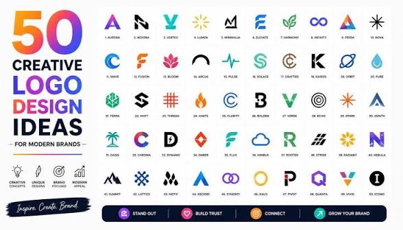
A logo is one of the most recognizable elements of a business’s visual identity. It can appear on websites, social media profiles, product packaging, advertisements, business cards, presentations, and many other marketing materials. While a logo may seem like a small part of a brand, it can have a significant influence on how people identify and remember an organization.
Creating a successful logo involves more than selecting an attractive image. A strong visual identity requires careful consideration of typography, colors, shapes, spacing, audience expectations, and the different environments where the logo will eventually appear. Understanding these principles can help businesses create a more professional and consistent presence.
Why Logos Are Important for Businesses
Businesses operate in increasingly competitive environments. Customers may encounter several companies offering similar products or services, making recognition particularly valuable.
A consistent logo gives customers a visual reference they can associate with a particular company. When the same design appears across a website, social media account, product, and advertisement, those repeated encounters can strengthen familiarity.
A logo can also help communicate a brand’s personality. A simple and modern design may suggest innovation, while a traditional style can create a more established impression. The design should support the overall identity rather than attempt to communicate every aspect of the business at once.
Start With Brand Research
Before developing a logo, businesses should understand what they want their visual identity to represent. This involves considering the company’s purpose, audience, products, services, values, and personality.
Research can help identify the visual styles commonly used within an industry. For example, technology companies may frequently use minimalist designs, while restaurants might rely more heavily on food-related imagery or typography.
The purpose of competitor research is not to copy existing designs. Instead, it helps designers understand the market and find ways to create something distinctive.
Understand the Target Audience
A logo should be appropriate for the people who will see it. Different audiences can respond differently to colors, typography, shapes, and imagery.
Consider who the business wants to reach and what those customers expect from the brand. A logo for a children’s educational service may have a different personality from one created for a professional consulting company.
Understanding the audience before designing can prevent decisions based entirely on personal taste.
Choose an Appropriate Logo Style
There are several common approaches to logo design.
Wordmarks
A wordmark uses the company name as the primary design element. Typography becomes especially important because the name itself forms the central visual identity.
Lettermarks
Lettermarks use initials instead of a complete business name. This can be useful for companies or organizations with long names.
Symbol Logos
Symbol logos rely primarily on a visual icon. A distinctive symbol can become highly recognizable when used consistently over time.
Combination Marks
Combination marks use both text and imagery. This provides flexibility because businesses can use the complete version or individual elements depending on the application.
Emblem Logos
Emblems place text and imagery inside a badge or similar shape. This style is often associated with institutions, clubs, organizations, and businesses seeking a traditional appearance.
Keep the Design Simple
Simplicity is one of the most useful principles in logo design. A simple logo can be easier to recognize, remember, reproduce, and scale.
Adding too many details can create problems. Small elements may disappear when the logo is displayed as a social media icon or mobile graphic.
A good design should have a clear central idea. Each shape, line, or decorative element should contribute to that idea rather than simply filling empty space.
Select Colors Carefully
Color can have a strong effect on visual perception. Different colors may communicate different emotions or associations, although their meanings can vary across cultures and industries.
Businesses should consider selecting a focused color palette that can be used consistently across their marketing materials.
It is also important to consider contrast. Text and graphic elements should remain visible against the background.
Testing a logo in black and white can also reveal whether the design depends too heavily on color to remain recognizable.
Typography and Brand Personality
Typography can influence how a logo feels. Serif typefaces can create a traditional appearance, while sans-serif fonts often provide a modern and clean look.
Some brands may choose custom lettering or modified typefaces to create a distinctive identity.
Regardless of style, readability should remain a priority. Customers should be able to recognize the business name without struggling to understand the lettering.
Consider Logo Scalability
A logo needs to work in many different sizes. It could appear on a large sign, a website header, a business card, or a tiny mobile icon.
Designers should test the logo at different sizes before finalizing it. If important details disappear when the logo becomes smaller, the design may need to be simplified.
Scalable artwork is also useful because businesses may need to reproduce the same identity across both digital and printed materials.
Design for Multiple Platforms
Modern businesses communicate through many channels. A logo may be used on:
- Websites
- Social media profiles
- Mobile applications
- Email signatures
- Product packaging
- Advertisements
- Business cards
- Presentations
- Promotional merchandise
Each environment can have different requirements. A horizontal logo might work well on a website header, while a compact symbol may be more suitable for a profile picture.
Creating several approved variations can help maintain consistency without forcing the same layout into every situation.
Avoid Excessive Design Trends
Following design trends can provide inspiration, but a logo should not depend entirely on temporary styles.
A trend that looks modern today may become outdated in a few years. Businesses should therefore prioritize their own identity and long-term goals.
A timeless design can still be updated when necessary. Minor adjustments to typography, color, or proportions can refresh an existing identity without completely changing it.
Use Visual Balance
Balance affects how a logo feels when viewed. A design with one very large element and several tiny elements may feel visually unstable.
Balance does not require perfect symmetry. Asymmetrical logos can be effective when the visual weight is carefully distributed.
Spacing is also important. Sufficient empty space around elements can make the logo easier to understand and prevent it from appearing crowded.
Think About Accessibility
Accessibility is an important consideration in modern visual communication. Logos should have sufficient contrast and remain understandable in different viewing conditions.
Businesses should avoid relying entirely on subtle color differences. Clear shapes and readable typography can make a logo more accessible to a wider audience.
Accessible design can also improve general usability because simple, high-contrast visuals tend to remain clear across different devices.
Explore Multiple Concepts
The first logo idea is not always the strongest. Exploring several concepts can help designers compare different approaches before making a final decision.
Experimenting with layouts, typography, colors, symbols, and proportions can reveal unexpected possibilities.
It is useful to evaluate each concept against the brand’s goals. Instead of asking only whether a logo looks attractive, consider whether it is recognizable, appropriate, flexible, and easy to reproduce.
Test the Logo in Real Situations
A logo should be tested outside the design workspace. Place it on realistic examples such as a website header, social media profile, business card, product package, or advertisement.
Testing can reveal issues that are not obvious when viewing the logo by itself.
For example, a logo might look excellent at a large size but become unreadable when reduced. Another design might work well on a white background but lose contrast on darker colors.
Maintain Brand Consistency
Once a logo has been finalized, consistent usage becomes important. Businesses should establish basic guidelines covering approved versions, colors, spacing, backgrounds, and minimum sizes. When businesses design logos with consistency in mind, it becomes easier to maintain a recognizable visual identity across different platforms.
A brand guide helps employees, designers, and marketing teams use the identity correctly.
Consistency also helps customers become more familiar with the visual identity over time.
When Should a Logo Be Redesigned?
A logo does not need to be changed simply because design trends evolve. Frequent redesigns can make it difficult for customers to maintain a connection with the brand.
However, a redesign may be appropriate when a company changes its audience, expands its services, merges with another organization, or discovers that its existing identity no longer works effectively on modern platforms.
Sometimes a complete redesign is unnecessary. Small refinements to typography, colors, spacing, or shapes may be enough to modernize the identity while preserving recognition.
Final Thoughts
A strong logo is the result of careful planning rather than simply adding attractive graphics together. Businesses should consider their audience, personality, colors, typography, scalability, accessibility, and long-term goals before finalizing a design.
The most effective logos are often clear and adaptable. They can work across different platforms while maintaining a recognizable connection to the brand. By exploring multiple concepts and testing designs in real-world situations, businesses can develop a visual identity that supports recognition and professional communication.
For businesses and creators looking for an accessible way to explore different visual concepts and design logos, modern online design tools can provide useful templates and customization options to help turn an initial idea into a polished brand asset.